It takes a lot to drive visitors to your website. People who do arrive reportedly spend 6-8 seconds deciding whether to stick around, so it’s critical that you create a strong positive impression while inside that window. When you get it right, your sales funnel is likely to see a significant boost in traffic.
Integrating a booking system with your website can further enhance this by simplifying appointment scheduling for both clients and businesses. This convenience can streamline the booking process, allowing clients to book after hours and saving time for everyone involved.
This article will cover two of the best ways to maximize engagement with a book now button to schedule demos with incoming leads.
Introduction to booking buttons
A booking button is a crucial element for any business that wants to increase its online presence and attract new clients. It provides a quick and easy way for potential customers to book appointments, services, or consultations directly from a website or social media page.
By adding a booking button to a website or Instagram page, businesses can reduce phone calls and streamline their booking process, making it incredibly easy for clients to book appointments.
This feature is especially important for businesses that want to increase their visibility and reach a wider audience. With a booking button, potential customers can take immediate action, leading to higher conversion rates and more efficient scheduling.
What is a booking button?
Most people want a quick and easy way to engage with you when they arrive at your website. The web design on your page will speak to them instantly and a value judgment will be made. After that, you have a few seconds to speak to them with words that identify their problems and point toward a solution.
If they can’t take immediate action to solve that problem with the click of a button, they’ll probably give up and go elsewhere. First impressions are crucial when users land on your website; if the interface isn’t intuitive, they’ll likely leave. This highlights the importance of usability testing services, which ensure your site is user-friendly and leads visitors toward quick, decisive actions.
Call-to-action vs booking buttons
A call-to-action is anything you ask your visitors or customers to do. For example, if you want them to call you, “Call now!” would be your call-to-action. If you want them to book with you, then your “book now button” can also serve as your call-to-action. Most importantly, use clear language in your CTAs to create a sense of urgency and motivate users to take immediate action.
A call to action button can solve this problem if it’s well implemented. Strategically placed, a CTA can guide potential customers through the purchasing process, boosting conversions and making it easier to promote and sell products on your website.
Ultimately, no matter what you call it, a ‘book now’ button is a powerful tool that allows potential customers to schedule appointments directly from your website or social media profiles.
A booking page vs a booking button
A booking page is simply a page on your website or a hosted scheduling page that’s dedicated entirely to booking.
The design of your booking page should be intuitive and user-friendly, ensuring that visitors can easily navigate through the process without any confusion.
Designing an Effective Booking Page
Designing an effective booking page is essential for any business that wants to increase its online bookings. The page should be clear, concise, and easy to navigate, with a prominent booking button that encourages immediate action.
The language used should be clear and direct, with no ambiguity or confusion. The page should also be optimized for mobile devices, with a responsive design that adapts to different screen sizes. One benefit of hosting WordPress on a VPS is that you can fine-tune server settings to improve mobile responsiveness and load times. Visual clarity also matters; using a photo editor to refine images, banners, wallpics, or mockups on your booking page can help create a more polished experience that guides users toward clicking the booking button.
By designing an effective booking page, businesses can increase the likelihood of conversion and reduce the number of potential customers who abandon the booking process.
A well-designed booking page should also include essential information such as services offered, pricing, and availability. This ensures that potential clients have all the information they need to make a booking decision quickly and confidently.
The Front and Center Approach
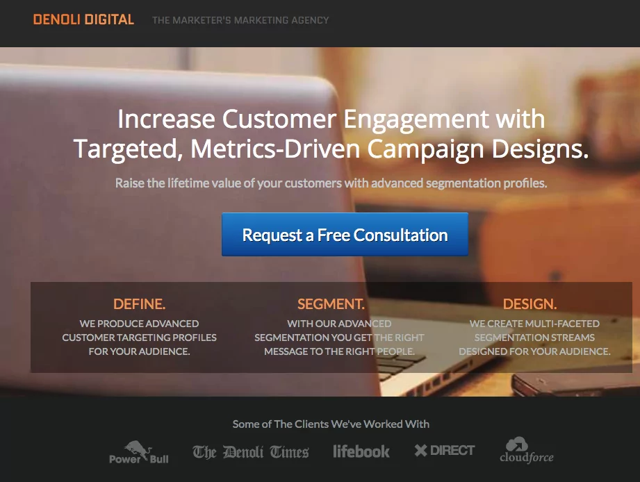
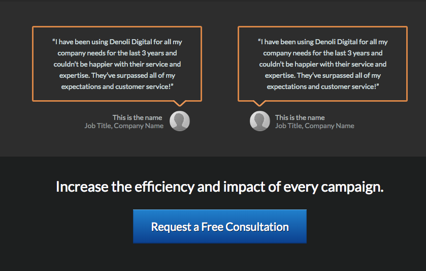
This screenshot comes from an Appointlet demo for an imaginary digital agency. The book now button has several features that make it effective:
Color: Relative to the orange and gray hues of the background image, the blue call to action provides enough contrast to make it POP.
Wording: The phrase “Request a free consultation” includes a verb (request) and an incentive (free consultation).
Size: Both the width of the button and its word length are short relative to the header and sub-header.
Clickable: When you click on the button, the solution immediately appears as an Appointlet booking page
Repeats at the bottom of the page: For visitors who scroll down the page to learn more, you want to be sure to reiterate the call to action at the bottom.
Promoting your business’s brand on platforms like Instagram can significantly enhance the visibility and engagement of your ‘Book Now’ button.
When visitors click on the book now button, the scheduler will pop up, lowering the opacity of your landing page without navigating away. Ensuring secure web hosting is essential to protect user data during interactions like scheduling appointments. Here is what it looks like visually:
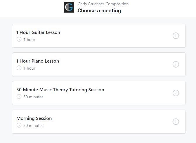
You can click here to view this demo site in real time and test it for yourself.
The Sidebar Form Approach
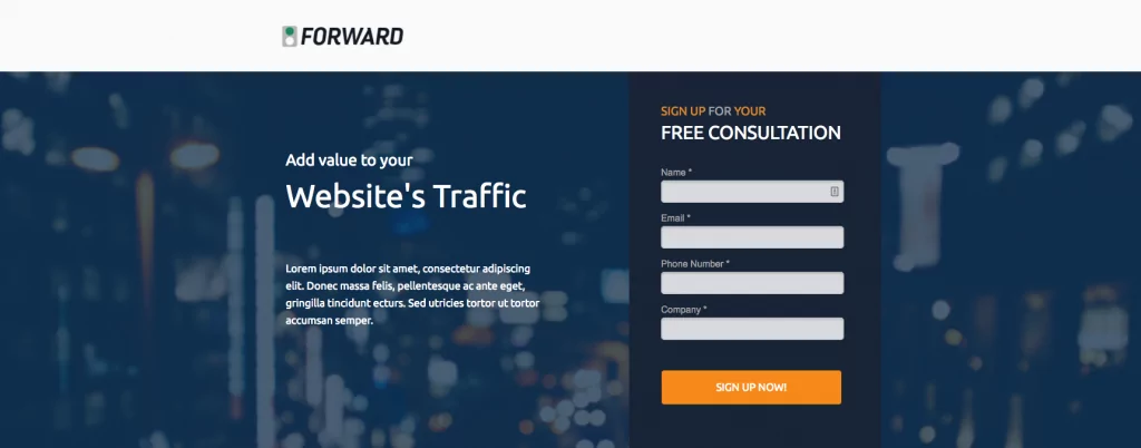
This second screenshot is also an Appointlet demo (located here), however you’ll notice that the landing page is formatted in a different way. With a series of form fields, you can collect data and pass it to Appointlet using form pre-population so users don’t have to enter their information twice. Connecting your accounts between social media platforms like Instagram and booking systems ensures real-time updates and easier management of bookings.
Sidebar Form: The header and sub-header are positioned off to one side, making space for a short vertical form.
Repeat Color Themes: At the top of the form, we’ve highlighted the words Sign Up and Your in orange. The same color is attributed to the CTA button at the bottom of the form.
Wording: Again we find an action (Sign up) but this time the reader is given an imperative. When should I do it? Now!
Readable + Clickable: The first call to action is simply a form header, but it primes the reader for the clickable CTA button at the bottom.
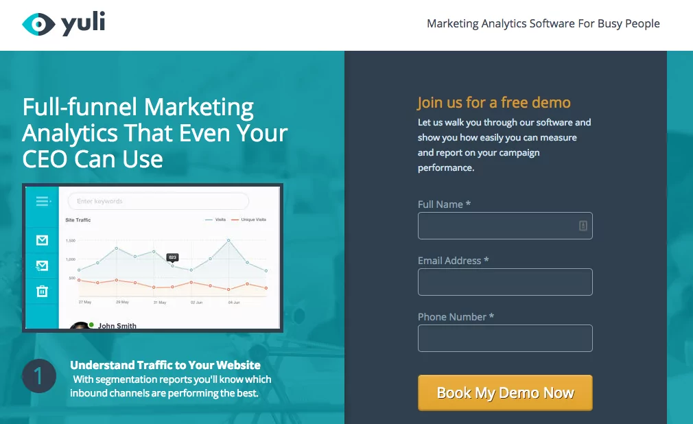
This final example presents a slight variation on the sidebar form. It makes use of the incentive approach (free demo), but the language is less urgent. A single sentence of help text is presented under the form’s header, explaining what an attendee will get from the demo. The words “book my demo” give the visitor ownership, in contrast to “book a demo”.
This approach can effectively transform a potential client who discovers your Instagram profile into an actual client by simplifying the appointment scheduling process.
Integrating with Social Media
Integrating a booking button with social media platforms like Instagram and Facebook can help businesses reach a wider audience and increase their online bookings. By adding a booking button to an Instagram page or Facebook profile, businesses can make it easy for potential customers to book appointments directly from their social media accounts. For WordPress sites, you can streamline this process even further by installing a WordPress social media plugin that syncs your booking call-to-action across all your active channels.
This can help reduce the number of steps required to book an appointment, making it more convenient for clients and increasing the likelihood of conversion. Businesses can also use social media to promote their services and encourage clients to book appointments, using tools like Instagram Stories and Facebook Ads to reach a wider audience.
In these instances, you’d still link to your booking page, but you’d link directly from social media to capitalize on the power of your existing Facebook, Instagram, or other social media following.
This integration not only enhances visibility but also leverages the power of social media to drive more bookings and grow the business. By utilizing the features of social media marketing, such as targeted advertising and real-time engagement, businesses can boost their presence. Having authority on social media platforms like Facebook and Instagram can obviously dramatically increase the effectiveness of a book now button.
Testing and Optimization
Testing and optimization are crucial steps in ensuring that a booking button is effective in increasing online bookings. Businesses should use tools like A/B testing and analytics to track the performance of their booking button and identify areas for improvement. This can include testing different designs, layouts, and language to see what works best for their target audience.
By continually testing and optimizing their booking button, businesses can increase its effectiveness and improve the overall user experience. This can help increase the number of bookings, reduce abandonment rates, and improve customer satisfaction.
Additionally, businesses can use data and insights from testing and optimization to inform their marketing strategy and improve their overall online presence. This ongoing process ensures that the booking button remains a powerful tool for driving conversions and enhancing customer engagemen
How to generate a Book Now button with Appointlet
If you’re new to Appointlet or have never used our sharing tool, you may be wondering how to make this approach work for your team. Fortunately, setting up a CTA button is incredibly easy.
All you need to do is log in to your Appointlet account, click on the share tool beside your scheduling page, and select Copy Link.
If you’d prefer to display your scheduling page directly on your site, we offer an html script that you can copy and paste right into your UI.
Click the same Share button but this time, select Embed on Website instead:
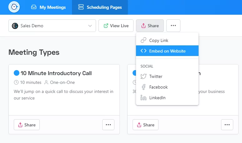
This will expose our ready-to-use html script. Hit the copy icon at the top right of the html box to copy to your clipboard. You can paste the code snippet directly into your website’s html and you’ll be good to go.
That’s all there is to it!
Not an Appointlet user? Try us for free today and get a done-for-you, ready-to-use book now button and page.

Ezra Sandzer-Bell
Ezra is a SaaS product marketing manager and the founder of AudioCipher, a music software company. He previously worked at Appointlet as a customer success manager and marketer, helping business managers optimize their online scheduling workflows.
